

Element UI走马灯中,通过属性height来设置高度,但是设置就是死的,不能自适应。要自适应需要监控窗口宽度的变化。
网上别人分享的太复杂了,这儿有简单的方法实现高度自适应。
首先,确定图片的最大高度
我的图片最大高度为270px,屏幕宽度超过container的宽度,这个值就不能再变化了。
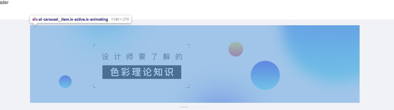
首先计算图片高度和网站宽度的百分比,例如,内容区域最大宽度为1180px,图片高度为270px,270/1180约0.22
那么,只要宽度被改变,高度就变化为宽度的0.22倍即可
data中声明hdgd属性,作为高度变量
VUE添加mounted事件:
mounted() {
        let that = this;
        window.onresize = function windowResize() {
          // 通过捕获系统的onresize事件触发我们需要执行的事件
          var w = window.innerWidth
          var h = 270
          if (w > 1180) {
            h = 270
          } else {
            h = 0.22 * w
          }
          that.hdgd = h + 'px'
          console.log(that.hdgd)
        }
      }
添加el-carousel,:height="hdgd"属性
效果如下:
完整代码:
图片和vue以及element自行引入
<!DOCTYPE html>
<html>
  <head>
    <meta charset="UTF-8">
    <!-- import CSS -->
    <link rel="stylesheet" href="lib/element-ui.css">
    <link rel="stylesheet" type="text/css" href="lib/css/index.css" />
  </head>
  <body>
    <div id="app">
      <header>Header</header>
      <el-container>
        <el-main>
          <el-row :gutter="10">
            <el-col :md="24">
              <el-carousel :type="cancard" indicator-position="outside" :height="hdgd">
                <el-carousel-item v-for="item in img" :key="item">
                  <img :src="'img/'+item+'.jpeg'" width="100%">
                </el-carousel-item>
              </el-carousel>
            </el-col>

          </el-row>
        </el-main>

      </el-container>
    </div>
  </body>
  <!-- import Vue before Element -->
  <script src="lib/vue.min.js"></script>
  <!-- import JavaScript -->
  <script src="lib/element-ui.js"></script>
  <script src="lib/template.js"></script>
  <script>
    var vue = new Vue({
      el: '#app',
      data: {
        show: true,
        hdgd: '270px',
        img: ['lb01', 'lb02', 'lb03']
      },
      computed: {
        cancard: () => {
          return ""
        }
      },
      methods: {},
      mounted() {
        let that = this;
        window.onresize = function windowResize() {
          // 通过捕获系统的onresize事件触发我们需要执行的事件
          var w = window.innerWidth
          var h = 270
          if (w > 1180) {
            h = 270
          } else {
            h = 0.22 * w
          }
          that.hdgd = h + 'px'
          console.log(that.hdgd)
        }
      }
    });
  </script>
</html>


